
Challenge
The brief was a flexographic printing challenge to design a wine label that could hold up technically while still feeling fresh and considered. The real challenge was finding a concept with enough personality to make a wine label genuinely interesting.

Process
The name Left on Red plays on the double meaning of being left on read. That universal, slightly painful experience of an ignored message. Leaning into that, the label design incorporates iMessage-style text bubbles, giving the brand an unexpected, distinctly modern voice in a category that tends to take itself very seriously. The visual direction aimed for boutique minimalism with a wink: clean enough to sit on a shelf next to premium labels, playful enough to start a conversation.
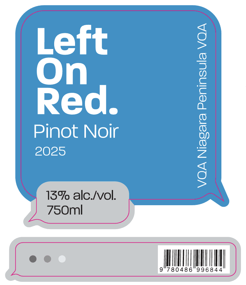
Outcome
A wine label concept that proves personality and craft aren't mutually exclusive. The flexographic constraints shaped rather than limited the design — the result is a brand that feels current, memorable, and a little bit witty.


Challenge
The brief was a flexographic printing challenge to design a wine label that could hold up technically while still feeling fresh and considered. The real challenge was finding a concept with enough personality to make a wine label genuinely interesting.
Process
The name Left on Red plays on the double meaning of being left on read. That universal, slightly painful experience of an ignored message. Leaning into that, the label design incorporates iMessage-style text bubbles, giving the brand an unexpected, distinctly modern voice in a category that tends to take itself very seriously. The visual direction aimed for boutique minimalism with a wink: clean enough to sit on a shelf next to premium labels, playful enough to start a conversation.
Outcome
A wine label concept that proves personality and craft aren't mutually exclusive. The flexographic constraints shaped rather than limited the design — the result is a brand that feels current, memorable, and a little bit witty.